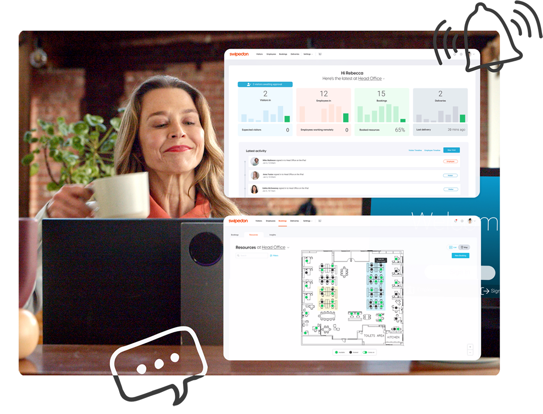
Automate visitor arrivals, track employee sign in and streamline resource bookings with a plug-and-play solution, easily configured to help you meet your compliance and safety needs.
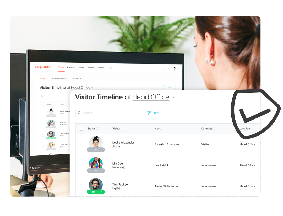
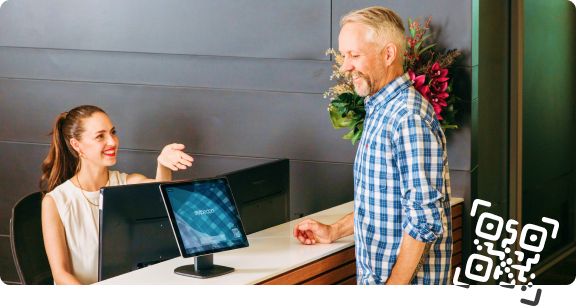
Create customizable visitor sign in flows that capture the information you require. Never keep visitors waiting, free up your reception and instantly notify host their guests have arrived.
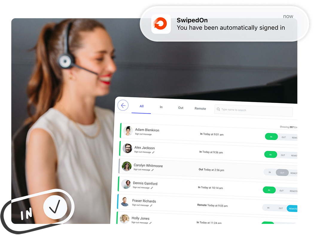
Make forgetting to sign in and out a thing of the past with features like automatic sign in and sign in reminders. Empower your employees with the ability to sign in remotely, roam between office locations, and set custom status messages and return times on sign out.
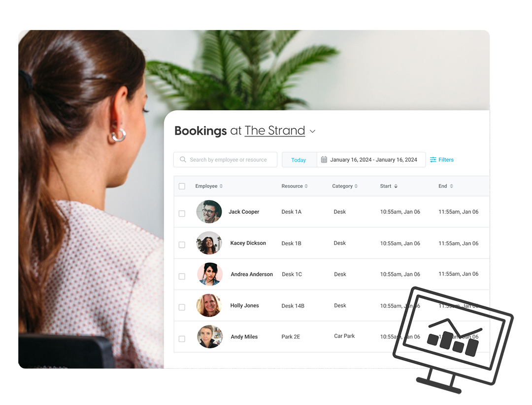
Desks, car parks, lockers, laptops & the office dog can be found and booked in an instant with SwipedOn. Let staff book what they need and admins can easily view the information from the SwipedOn web dashboard.
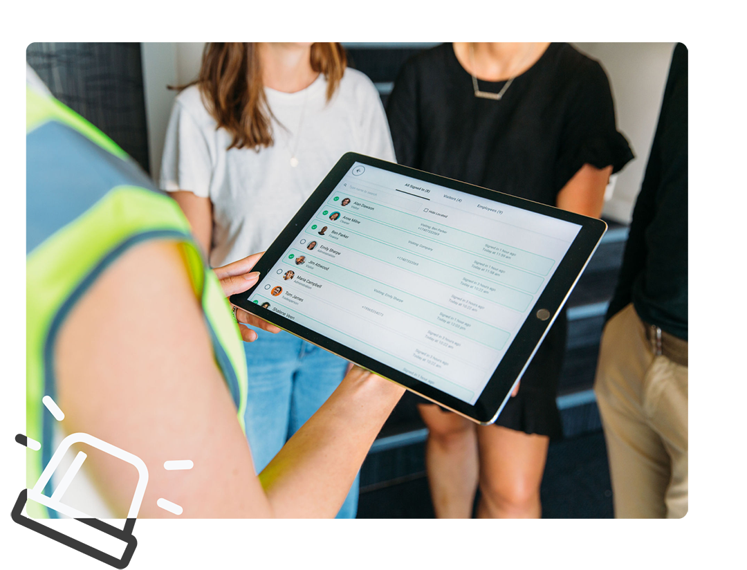
Keeping track of visitors and employees with SwipedOn means you are always prepared for an emergency evacuation with the most up-to-date information about who is on your premises.
Be audit ready with secure, digital records of everyone who has been on your premises. SwipedOn enables you to reduce human error and protect the personal information of your visitors & employees.


.svg)
.svg)


 Germany - Deutsch
 South Korea - 한국인
 Taiwan - 中文 - 繁體
 China - 简体中文